Christine Fwu Combines Handmade Techniques and Modern Aesthetics
Posted on | Updated
The designer and recent ╔½┐ŌTV grad researches the history of printed materials to enliven her work in the present.
(BDes 2020) has been busy.
During her time at Emily Carr University, Christine was Editor in Chief for the Woo, bringing the creative student-run magazine to life, as well as a Designer and Researcher for the . Since then, sheŌĆÖs tackled graduating during the pandemic, commercial clients, and finishing up her grad project, Pressed Ephemera.
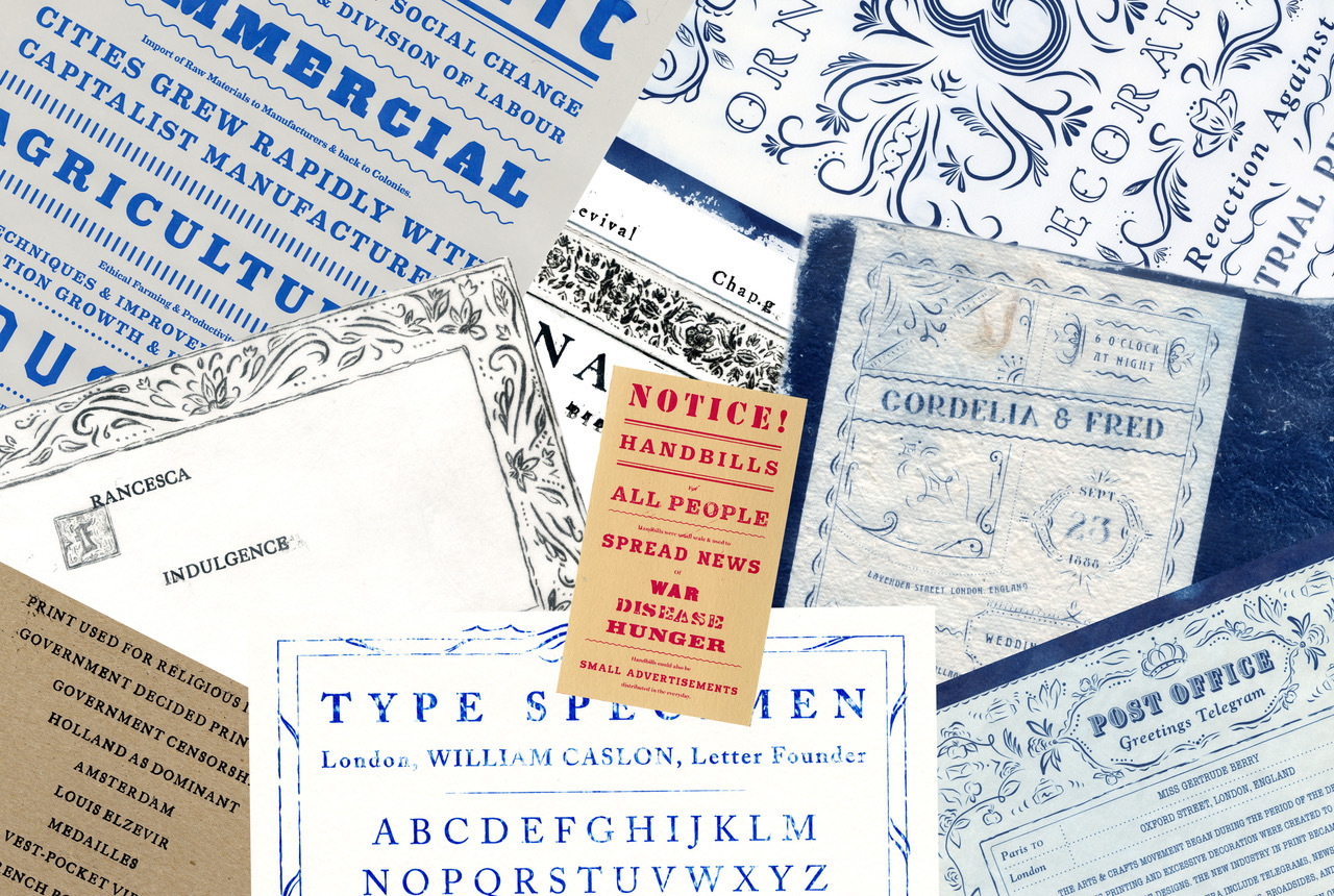
With an interest in the intrinsic meaning and beauty in handmade processes, Christine approaches her work by leveraging critical thinking and history.
ŌĆ£As a designer, I love to find ways to incorporate handmade processes in any project that I take on,ŌĆØ Christine said. ŌĆ£I believe that technology is truly amazing in putting new visions to life, but going back to using your hands to make something really gets you to think more carefully about how and why you make.ŌĆØ
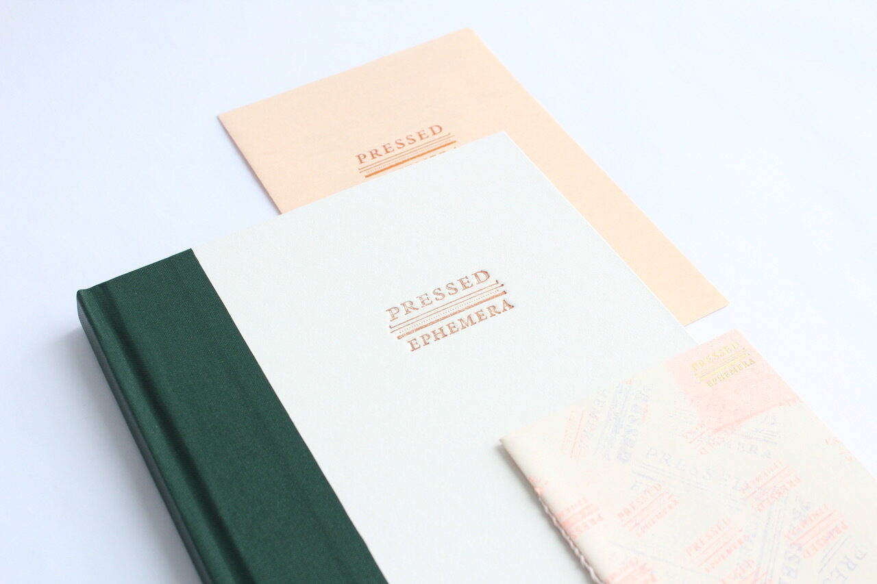
You can see the handmade quality in Pressed Ephemera ŌĆö the physicality of pressing a stamp to create patterns, fading ink dependent on pressure, and the human touch. Christine explains that Pressed Ephemera came to life through her immense interest in handmade and printed materials along with the old styles of design and aesthetics that were created from the past.
ChristineŌĆÖs interest in the handmade extended to the experimental student-run magazine, .
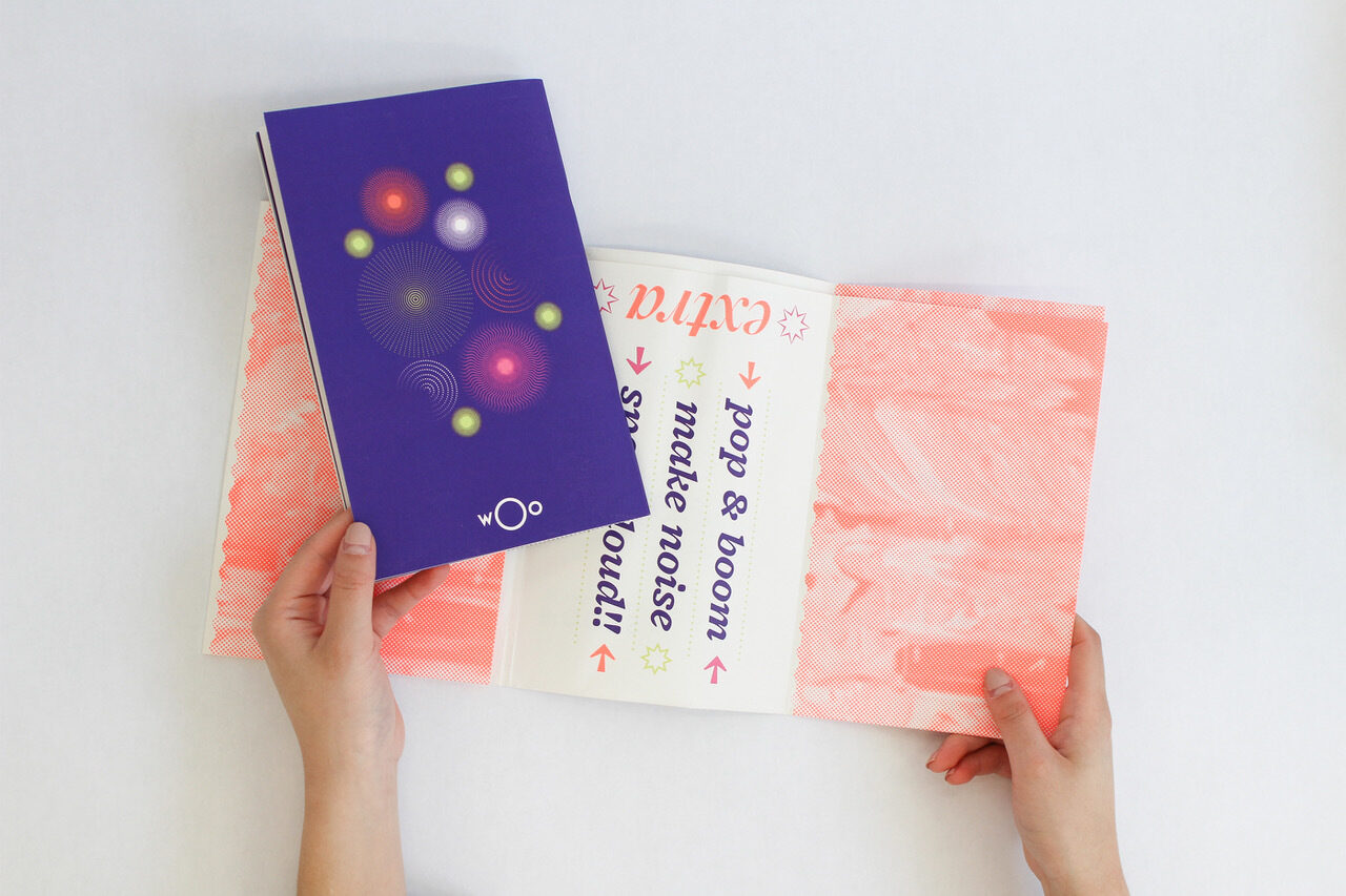
ŌĆ£My favourite issue while working on the Woo as the Editor in Chief would be Extra,ŌĆØ she said. ŌĆ£My Creative Director, (BDes 2020) and I set high hopes to create a publication like no other; we wanted this one to really stand out and embody the word extra.ŌĆØ
This was the beginning of ChristineŌĆÖs exploration into the old styles of design and researching printed artifacts.
ŌĆ£I became intrigued by the idea of a printed book and the possibilities of what it could be,ŌĆØ Christine explained. ŌĆ£Triet and I wanted the viewers to experience the book like opening a present, and interact with each fold of the poster wrap while visually taking in the design, to then open up to the book that is wrapped inside.ŌĆØ
Christine continued to explain that the execution and design of the poster wrap included a lot of hand folding and testing before the prototype was made.
ŌĆ£This process, like many handmade processes, required an immense amount of intention and care,ŌĆØ she said.
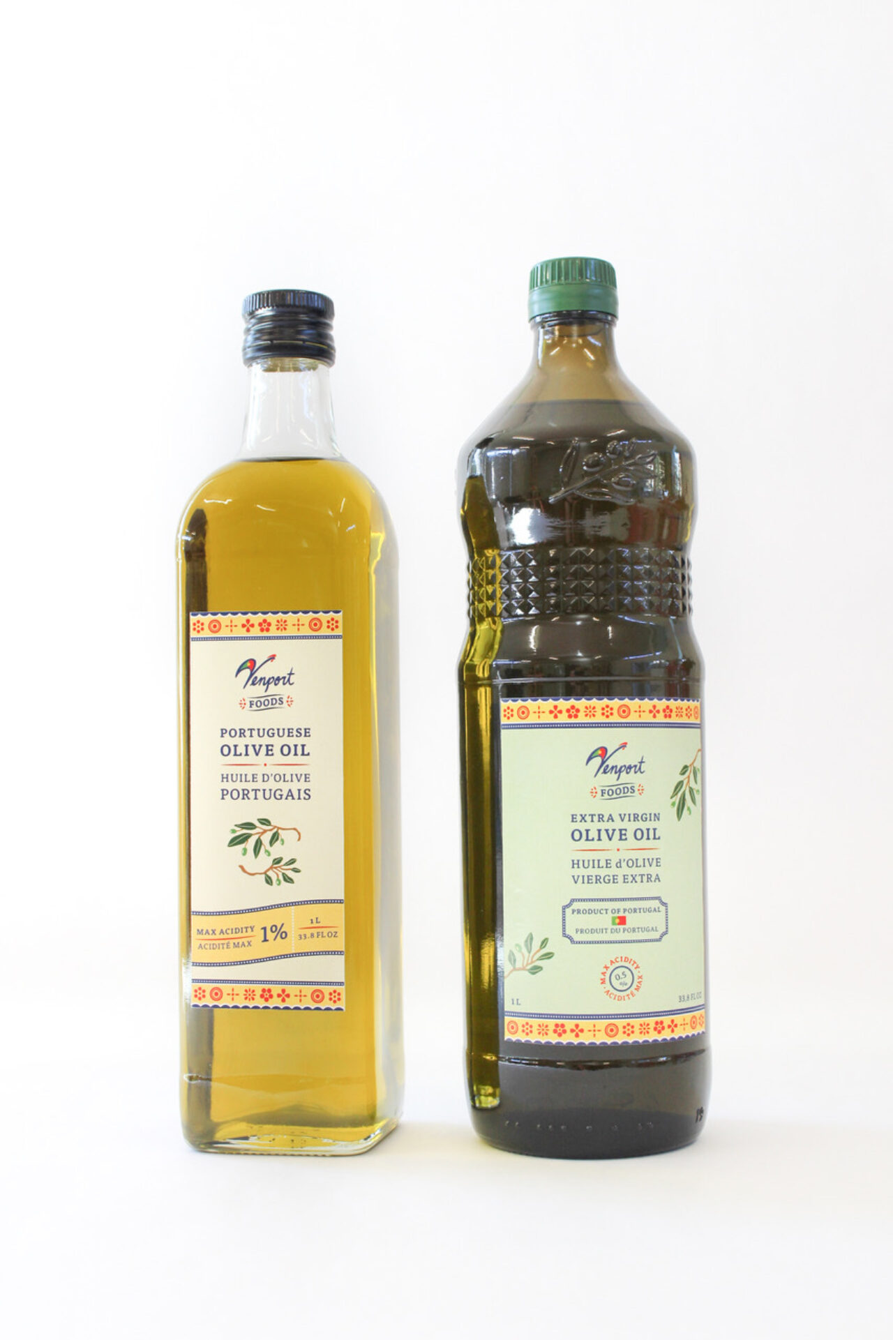
Since graduating, Christine has taken on a commercial project for Venport FoodsŌĆÖ new brand identity. The olive oil labels showcase her immense attention to detail and love of the handmade as evident an homage to the symbology of a rooster in the hand-lettered Venport logo.
ŌĆ£The Barcelos rooster is a Portuguese symbol for ŌĆślove of lifeŌĆÖ,ŌĆØ Christine shared on . While COVID-19 has slowed down export, itŌĆÖs possible we may see these labels in Vancouver stores one day.
ŌĆ£I had an amazing time self-directing the project and I am quite proud of how they turned out,ŌĆØ she said. ŌĆ£Creating these labels has also made me realize that I am especially interested in packaging design, and I find a lot of joy in creating visual identities for new products.ŌĆØ
As for the future?
ŌĆ£I would love to work for a studio that cares a lot about their clients and their stories, and puts intention, meaning, and care in developing each and every project,ŌĆØ she said.
To see more of ChristineŌĆÖs work, visit her or to connect.
--
This story originally published on the .